← Back to work

01 — Case Study

PayNORA — A confidence-first mobile payments case study

A confidence-first mobile payments app that helps older adults pay digitally on their own — without fear, hesitation, or dependence on family.

ResearchStrategyAccessibilityAI AssistedVoice GuidanceFinTech
Project
PayNORA
Role
Product Designer
Duration
90 Days
Team
9-member multidisciplinary team
Platform
Mobile · iOS & Android
Contribution
Research · Strategy · UX · UI · Testing
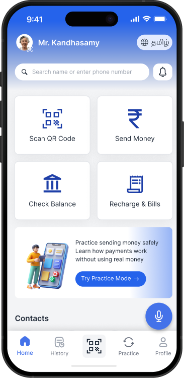
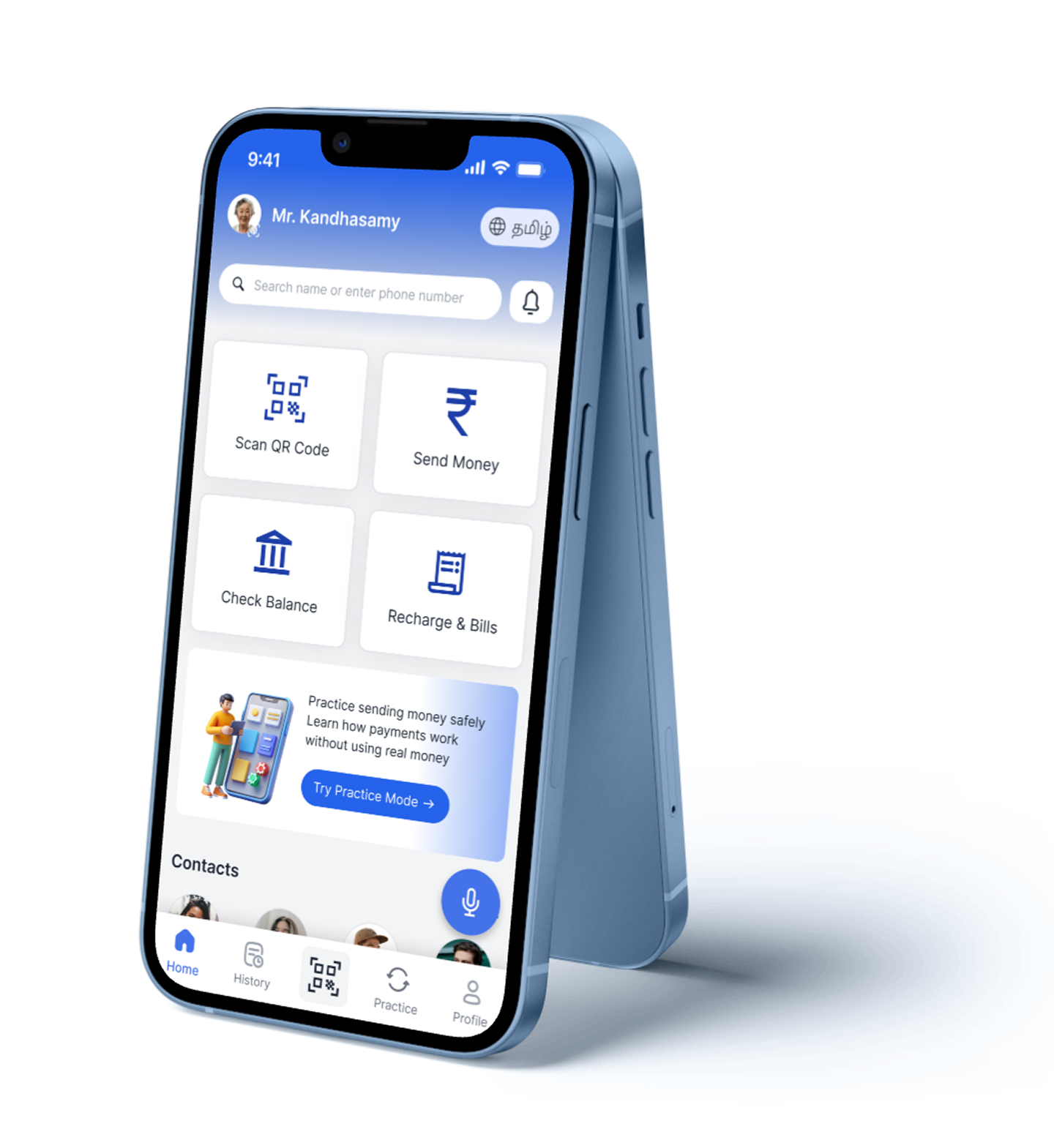
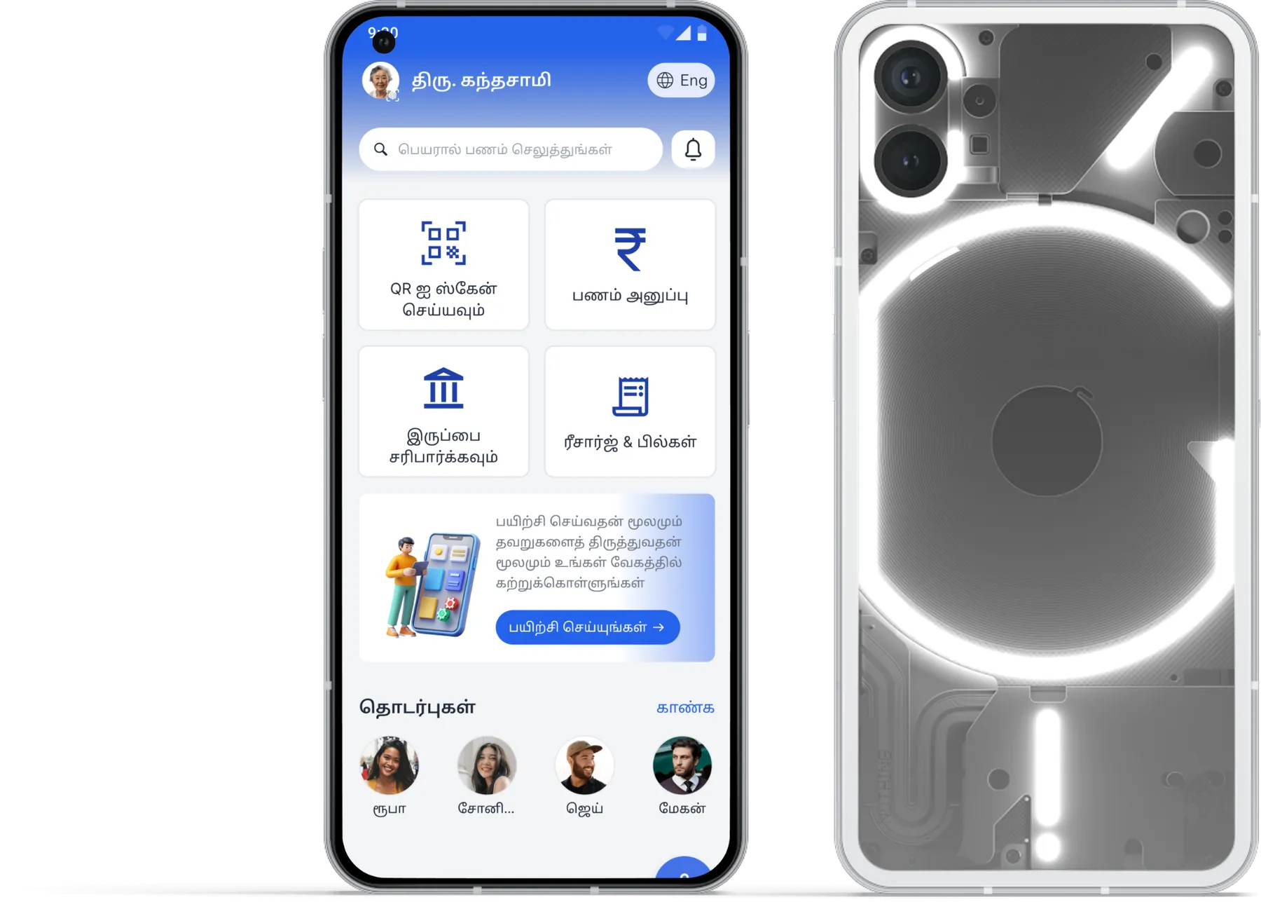
PayNORA app — stacked mobile mockups showing the home dashboard and quick actions.

02Project Overview

Why PayNORA exists.

Problem

Older adults hesitate to pay digitally — not because it's hard, but because they fear making a mistake.

Existing apps optimise for speed. They rarely account for anxiety, low tech confidence, or fear of an irreversible error.

Why PayNORA exists

To make independent digital payment feel calm — not risky.

Millions of older adults still rely on family for every transaction. PayNORA exists to close that gap by designing for confidence — the missing ingredient in existing payment apps.

Design Process — Double Diamond

4 stages · 6 weeks

01 · Discover

Divergent
  • · Interviews
  • · Field shadowing
  • · Market scan

02 · Define

Convergent
  • · Insight synthesis
  • · Problem framing

03 · Develop

Divergent
  • · Ideation
  • · Wireframes
  • · Prototypes

04 · Deliver

Convergent
  • · Usability tests
  • · Iteration
  • · Handoff

03Research

Four observations that shaped the product.

Field interviews and shadowing with 20+ older adults across households, shops and community spaces. Every insight was tied to a design decision.

Insight 01

Observation

Users rechecked every screen twice before tapping Pay.

Insight

Confirmation isn't a step — it's a source of anxiety.

Decision

Introduced a calm, plain-language confirmation screen.

Insight 02

Observation

Many handed the phone to a family member at UPI PIN.

Insight

Dependence protects them from a mistake they can't undo.

Decision

Practice Mode lets users rehearse safely with zero risk.

Insight 03

Observation

Font sizes and dense UI caused visible strain.

Insight

Accessibility isn't a toggle — it's the default state.

Decision

Senior Mode with larger type, higher contrast, calmer layout.

Insight 04

Observation

Fraud calls were the #1 topic in interviews.

Insight

Trust is broken outside the app, not inside it.

Decision

In-flow fraud awareness prompts before sensitive actions.

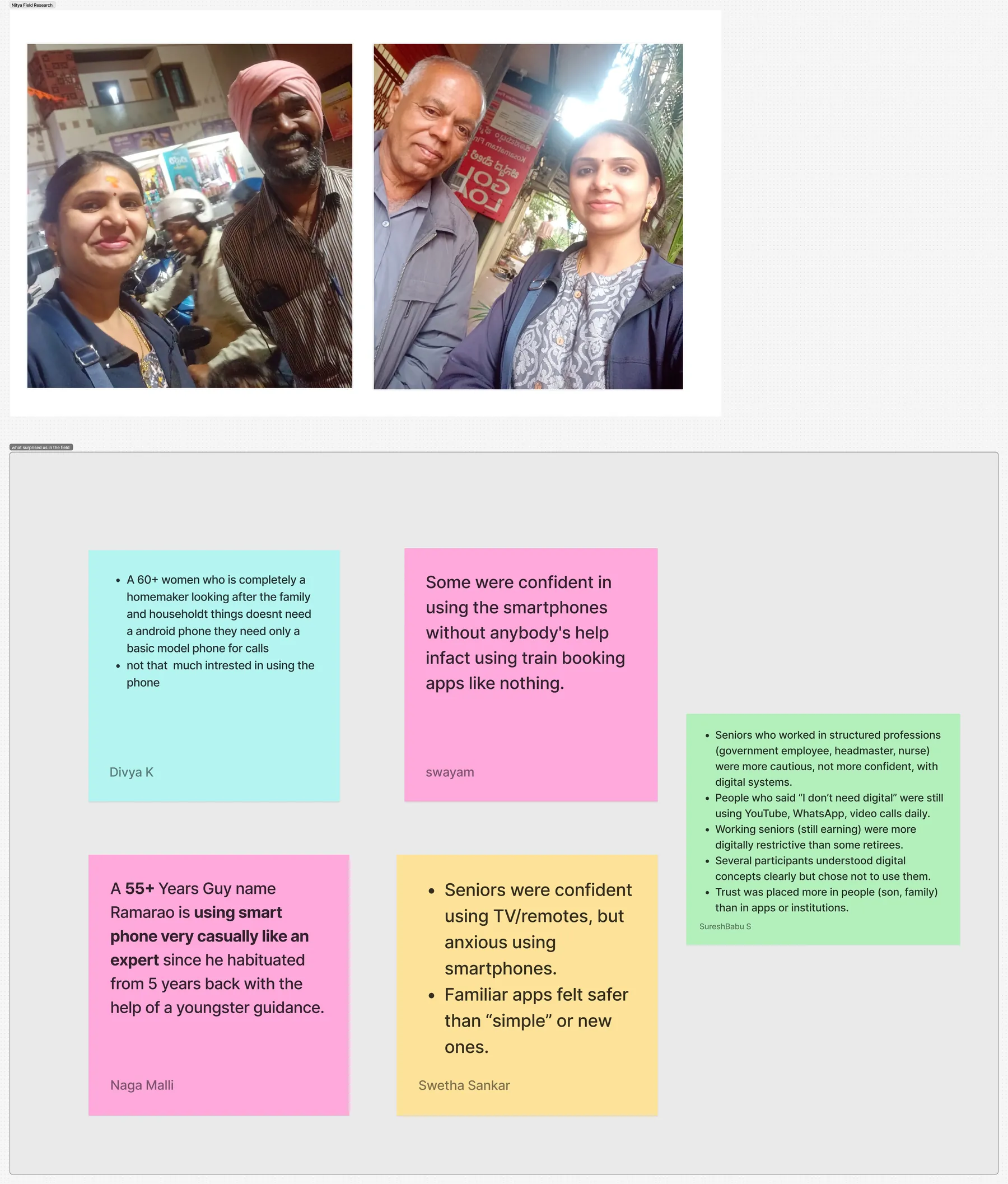
FigJam affinity board — clustered participant quotes across behaviour, friction, coping and emotion.

Research Artifact — Affinity Board

20+ interviews clustered across four lenses, surfacing the hesitation patterns behind every design decision.

04Product Strategy

A confidence-first product bet.

Product Vision

Enable every older adult to pay digitally — independently and without fear.

North Star

Independent transactions completed with high confidence, per active user, per week.

Success Metrics

40%

Faster task completion

75%

Independent success

0 → 3.6

Confidence score (of 5)

AA

WCAG 2.1 compliance

Design Principles

Confidence over speed

Optimise for how safe users feel, not seconds saved.

Recognition over recall

Show, don't ask users to remember.

Reassurance in-flow

Explain what will happen — before it happens.

Accessibility by default

Legible type, contrast and touch targets baseline.

How Might We

  • 01

    How might we make users feel safe before, during and after payment?

  • 02

    How might we let users practise without financial risk?

  • 03

    How might we design for the widest range of ability by default?

05Feature Strategy

Every feature earned its place.

Each feature ties a real user problem to a design decision and its measurable impact.

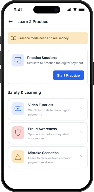
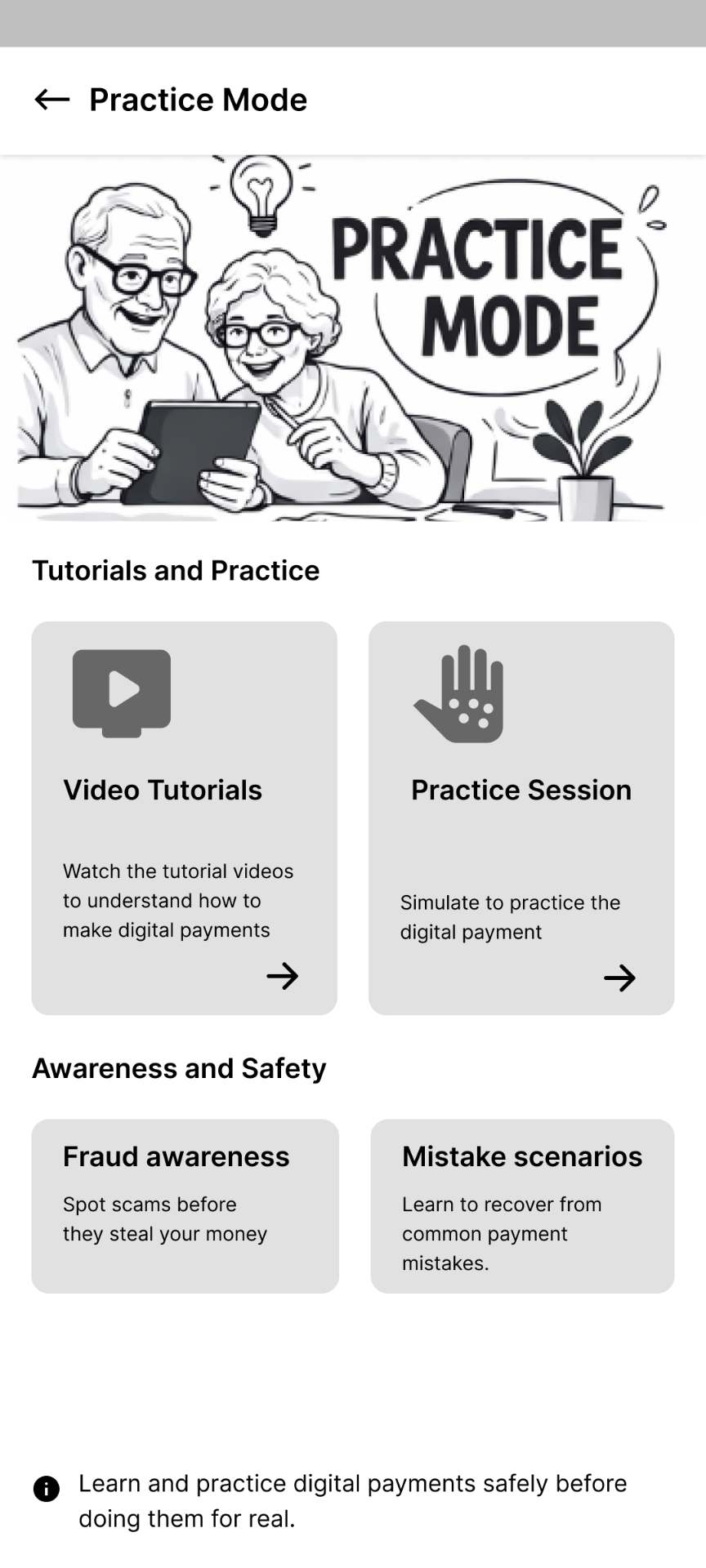
Practice Mode interface preview

Practice Mode

Signature

Problem

Users feared making a real mistake with real money.

Decision

A sandbox that mirrors real payment flows without transacting.

Impact

Users tried features 3× more often before real use.

Voice Guidance interface preview

Voice Guidance

02

Problem

Small type and silent screens left users unsure at each step.

Decision

Calm, plain-language voice cues woven into every critical action.

Impact

Users self-corrected mid-flow instead of stopping.

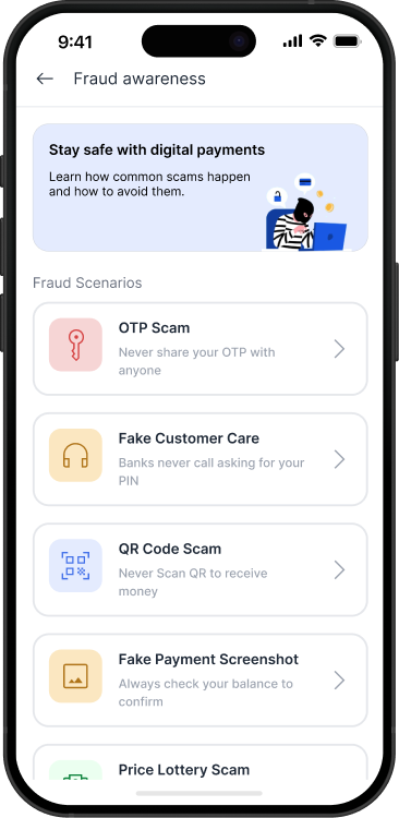
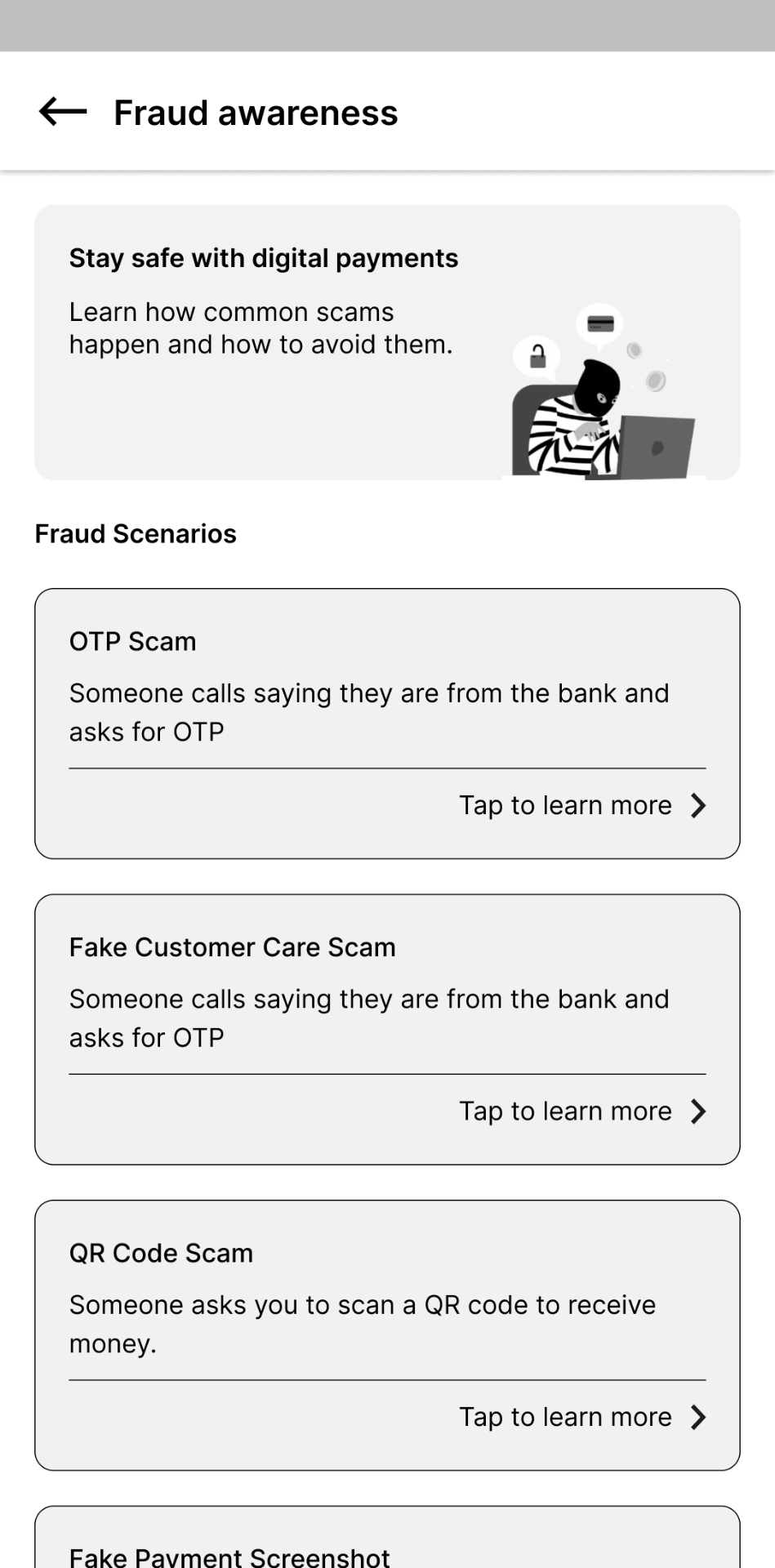
Fraud Awareness interface preview

Fraud Awareness

03

Problem

External scam calls broke user trust in the app.

Decision

Contextual prompts before sensitive actions.

Impact

Users paused, verified, and reported suspicious cases.

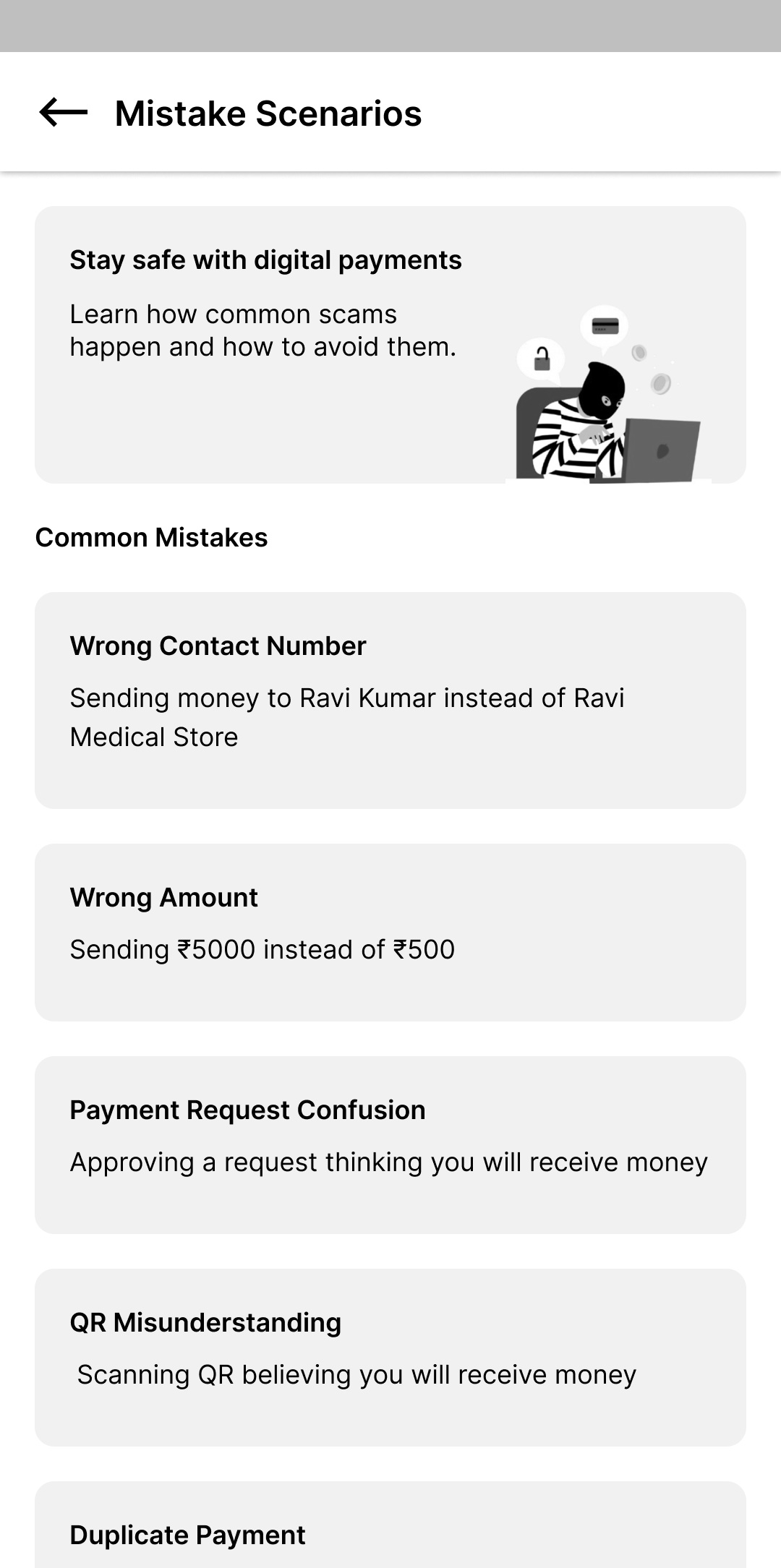
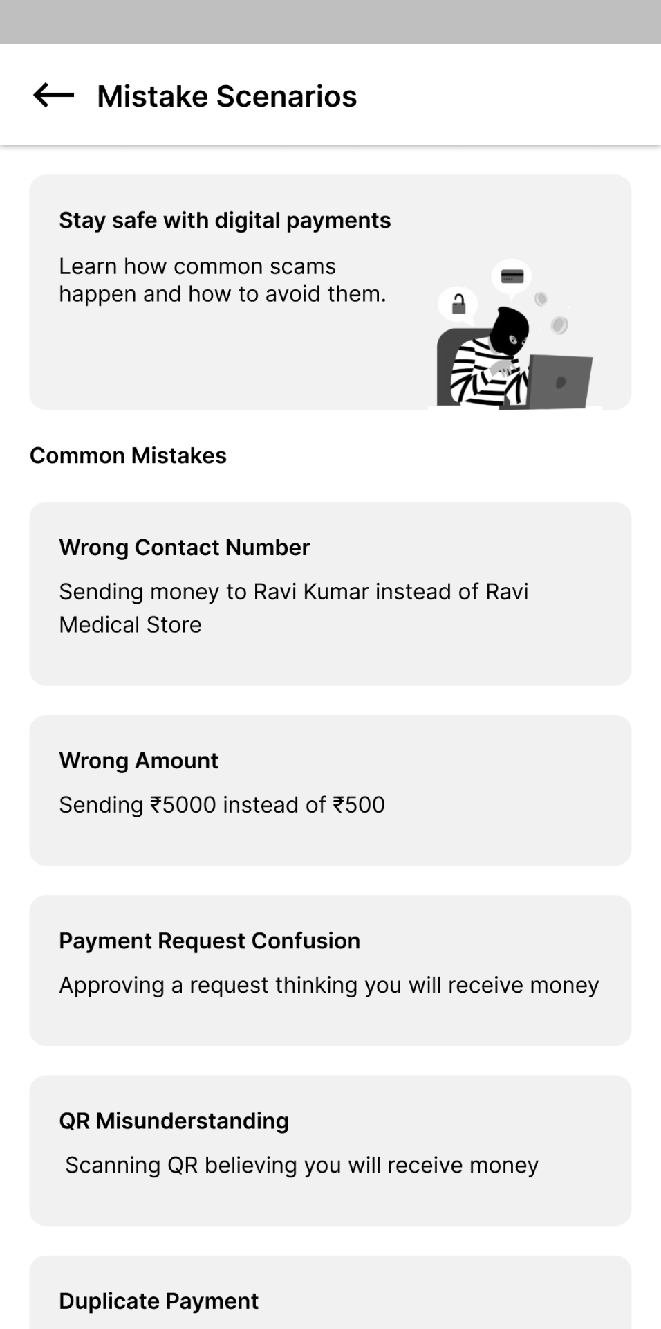
Mistake Recovery interface preview

Mistake Recovery

04

Problem

Near-misses left users afraid to try again.

Decision

Named scenarios and a calm path back to safety.

Impact

Recovery reframed as learning, not failure.

06Experience Design

Structure and flow, in one view.

End-to-End Payment Journey

  1. 01

    Open App

  2. 02

    Select Contact

  3. 03

    Enter Amount

  4. 04

    Review Summary

  5. 05

    Voice Confirm

  6. 06

    Enter PIN

  7. 07

    Success + Recap

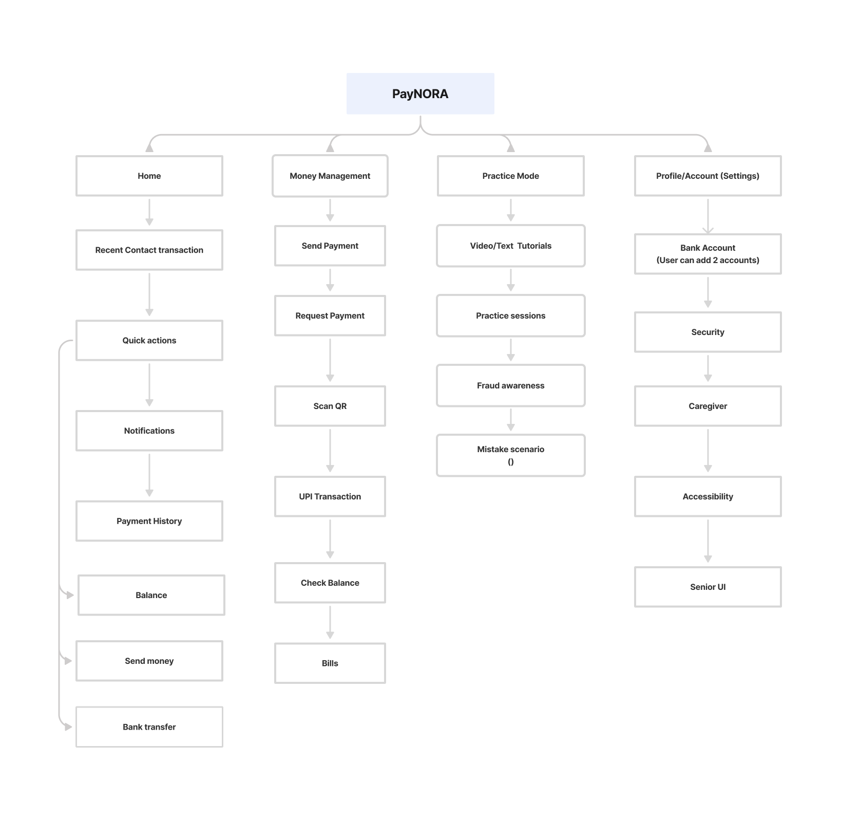
PayNORA information architecture — sitemap of Home, Money Management, Practice Mode and Profile.

Supporting Artifact — Information Architecture

Four top-level hubs keep the surface area calm and the mental model predictable.

07Wireframes & Iterations

From baseline to confidence-first.

Four iterations — each pass responded to a real user reaction.

Wireframe 01 — Baseline

Wireframe 01

Baseline

Standard payment flow — dense UI and small confirmation states.

Wireframe 02 — Calm & Guided

Wireframe 02

Calm & Guided

Plain-language confirmation, larger targets, in-flow reassurance.

Wireframe 03 — Practice-first

Wireframe 03

Practice-first

Sandbox mode surfaced as a first-class entry to the app.

Final Direction — Confidence-First

Final Direction

Confidence-First

Senior Mode, Practice Mode, and voice woven into the core journey.

08Final Solution

Four journeys. One product.

Grouped by user intent — not by screen count.

Journey 01

1 screen

PayNORA home dashboard

Home Dashboard

Calm entry into the app.

Journey 02

1 screen

Practice Mode landing screen

Practice Mode

Rehearse without risk.

Journey 03

1 screen

Fraud awareness library

Fraud Protection

In-flow awareness before sensitive actions.

Journey 04

1 screen

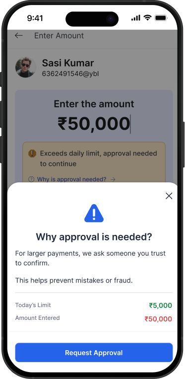
Caregiver approval sheet for large payment

Caregiver Approval

A trusted second pair of eyes on larger payments.

09Interactive Prototype

Experience the Product.

Best viewed on desktop · takes 20–40 seconds to load

10Validation & Impact

What changed for users.

Moderated usability testing with older adults across three cities. Refined across six iteration cycles.

40%

Faster task completion

75%

Independent completion (from 0%)

3.6 / 5

Post-test confidence score

AA

WCAG 2.1 compliance

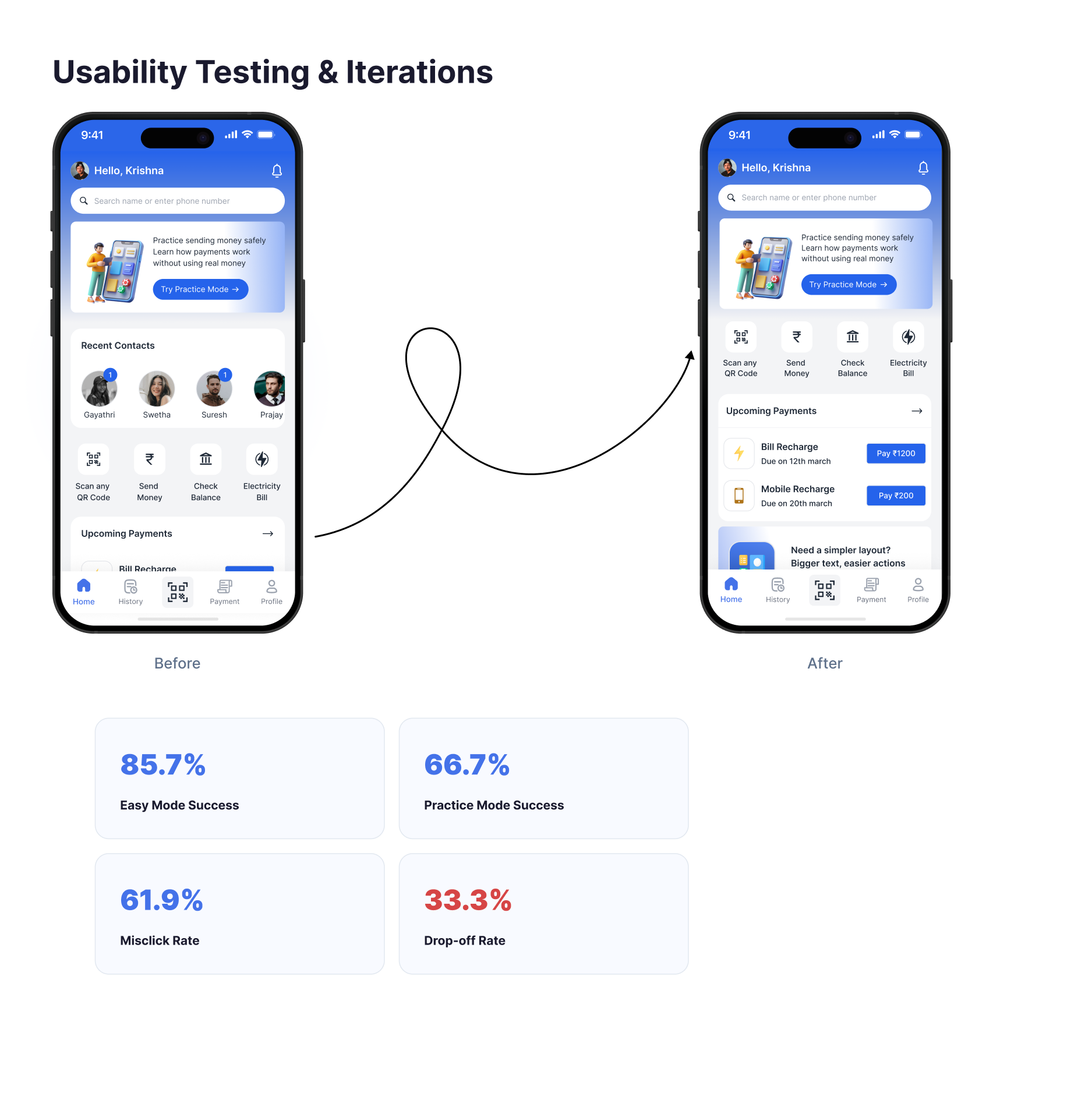
Usability testing metrics — before and after home dashboard comparison with success-rate breakdown.

Usability Testing — Iteration Artifact

Before vs. after the confidence-first pass.

Task success rose across every mode. The largest lifts came from Practice and Senior Mode — the two flows built directly from testing feedback.

11Recognition

Recognised at Design for Change.

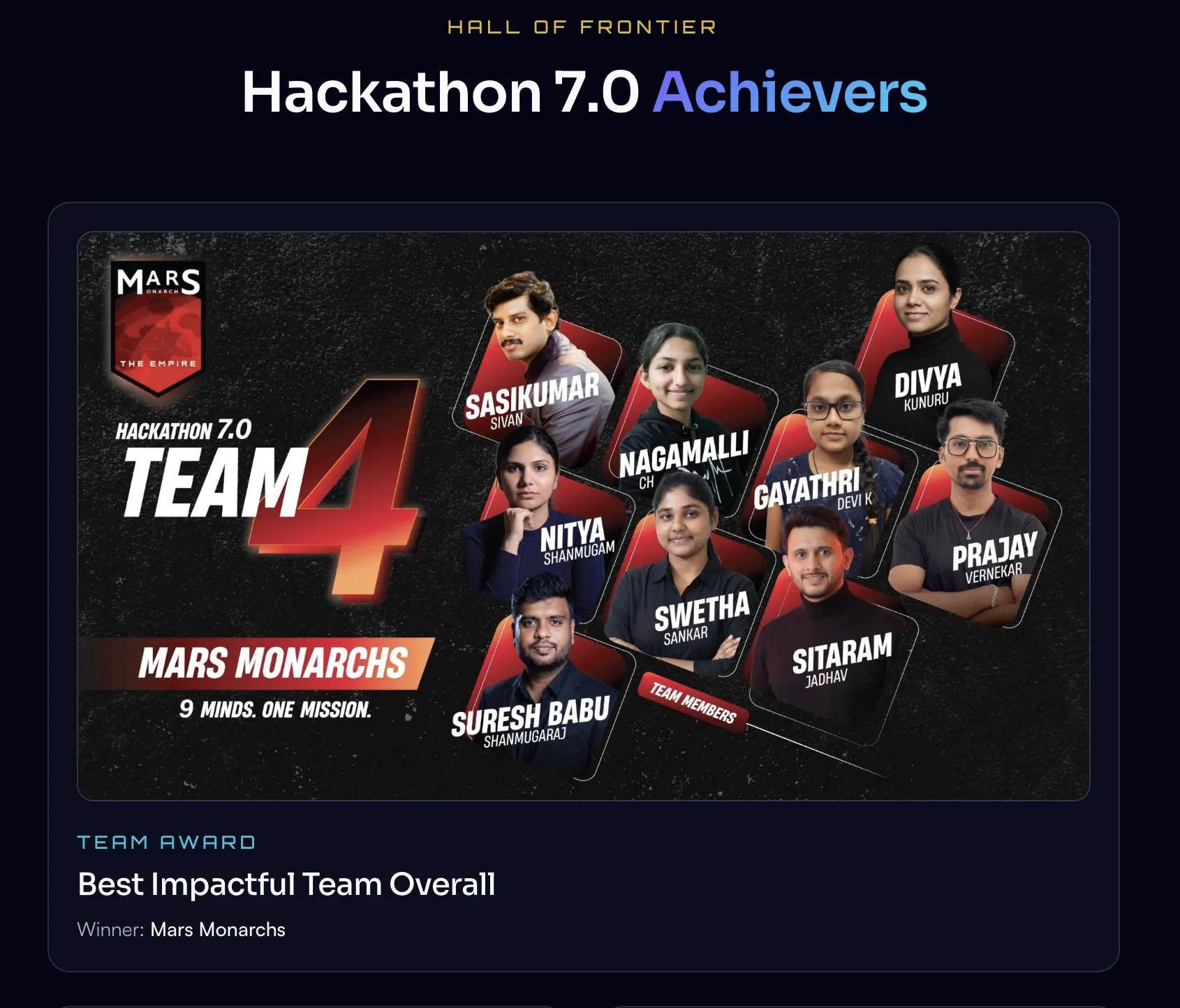
Hackathon Recognition

Best Team Project — Design for Change Hackathon.

PayNORA was developed during the Design for Change Hackathon and was recognised as one of the Best Team Projects during the final showcase. The project received on-stage recognition for its confidence-first approach to helping older adults perform digital payments independently.

View Hackathon Showcase
Hackathon 7.0 Achievers — Mars Monarchs recognised as Best Impactful Team Overall at Design for Change.

11Reflection

Three questions. Honest answers.

What worked

Framing the problem as confidence, not usability, unlocked clearer design decisions.

What I'd improve

Longer longitudinal testing to see how confidence holds across weeks of real use.

What comes next

Extending the confidence framework to insurance, investments and healthcare payments.

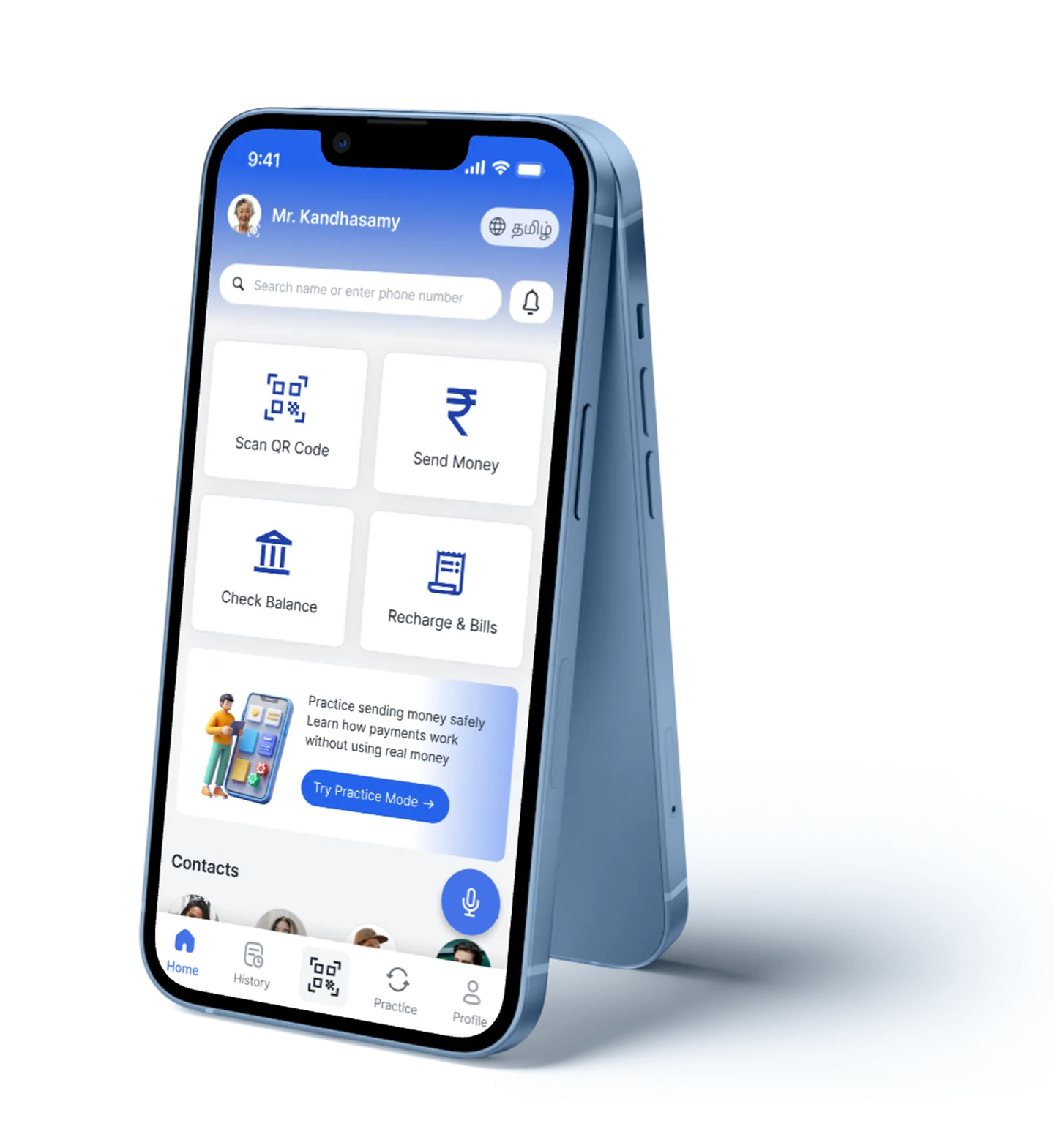
PayNORA — final device mockup showing a calm, independent payment moment.

Closing

Designing confidence into every payment.

PayNORA was never about making payments faster. It was about helping people feel confident enough to complete them on their own.

Next Project

Decode DFC

— Contact

LET'S DESIGN
MEANINGFUL
PRODUCTS
TOGETHER.

— Get in touch

Open to Product Designer roles

Hi, I'm Nitya — a Product Designer focused on Fintech, HealthTech, and Enterprise SaaS. If you're hiring or want to talk about a project, the fastest way is email.

Resume
Usually replies within 24 hoursBengaluru · Remote or onsite
NityaProduct DesignerUX ResearcherDesign ThinkerHuman-CenteredAccessibilityInteraction DesignDesign SystemsResearchNityaProduct DesignerUX ResearcherDesign ThinkerHuman-CenteredAccessibilityInteraction DesignDesign SystemsResearch
© 2026 Nithya ShanmugamDesigned & built with care.