← Back to work

03 — Case Study

MedEase — A connected medication ecosystem case study

A connected medication ecosystem that helps elderly users stay independent — and caregivers stay quietly informed.

Product ThinkingIoT UXService DesignInteraction Design
Project
MedEase
Timeline
60 Days
Team Size
8 Members
Role
Product Designer
Platform
IoT · Mobile · Hardware
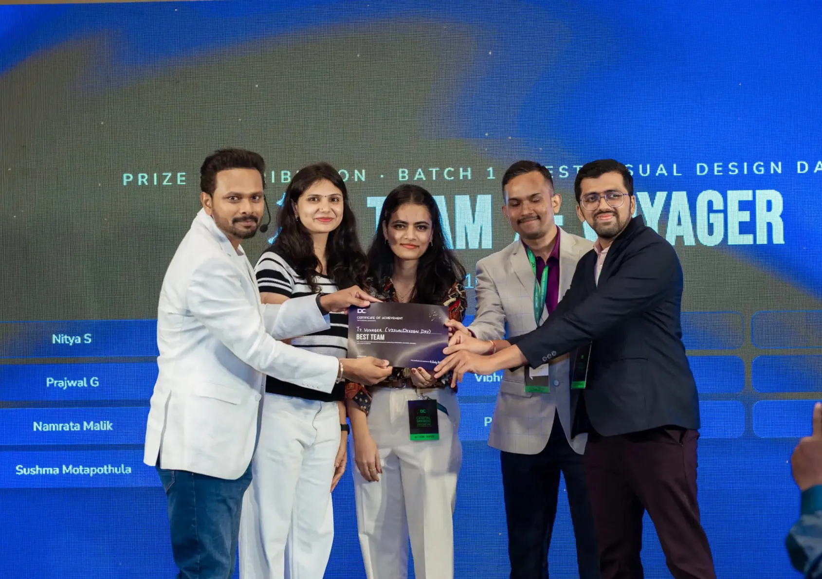
Recognition
Hackathon Winner

02The Problem

Missed doses aren't a memory problem. They're a confidence problem.

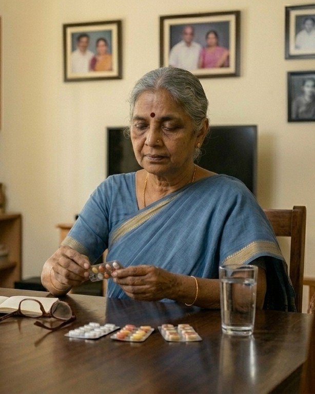
Nearly half of adults over 65 manage five or more medications a day. When routines slip, health slips with them — and independence is the first thing families take away.

Existing reminders bark, buzz and repeat. They don't check whether the pill was actually taken, and they don't quietly reassure the people who worry from a distance.

So we asked ourselves…

"What would it take to make one dose feel effortless — for both the person taking it and the person watching?"

03Product Journey

From a lamp on a nightstand to a medication ecosystem.

Research, ideation and iteration told as one continuous shift in thinking — not four separate chapters.

Approach
Discover
Define
Develop
Deliver

01 · Beat

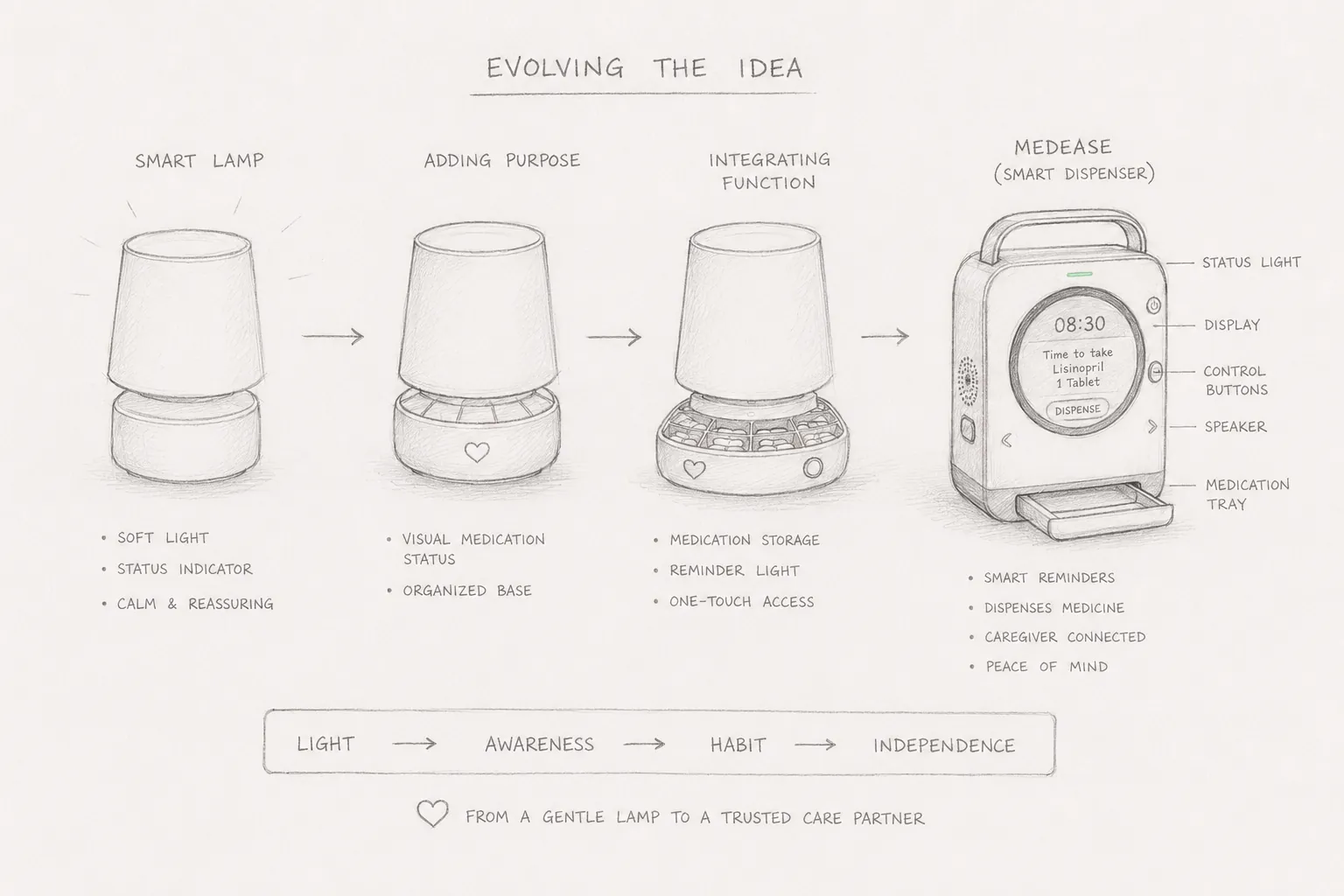
We started with a Smart Lamp

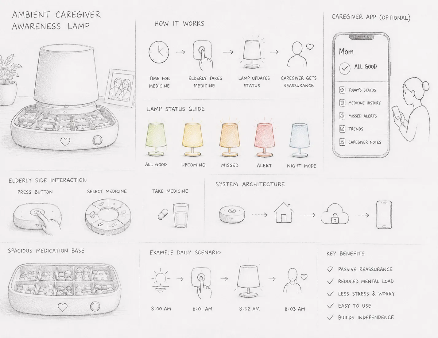
A gentle ambient reminder that glowed at medication times. Beautiful, calm — and completely unable to know if the dose was actually taken.

02 · Beat

Reminders alone don't solve adherence

Interviews with caregivers made it obvious: the anxiety isn't 'did they hear it?' — it's 'did they take it?'. A reminder without confirmation is just noise.

03 · Turning point

The turning point

We reframed the brief. Not a reminder. Not a lamp. A dispensing ecosystem — dose, detection and reassurance held together as one product.

04 · Beat

MedEase took shape

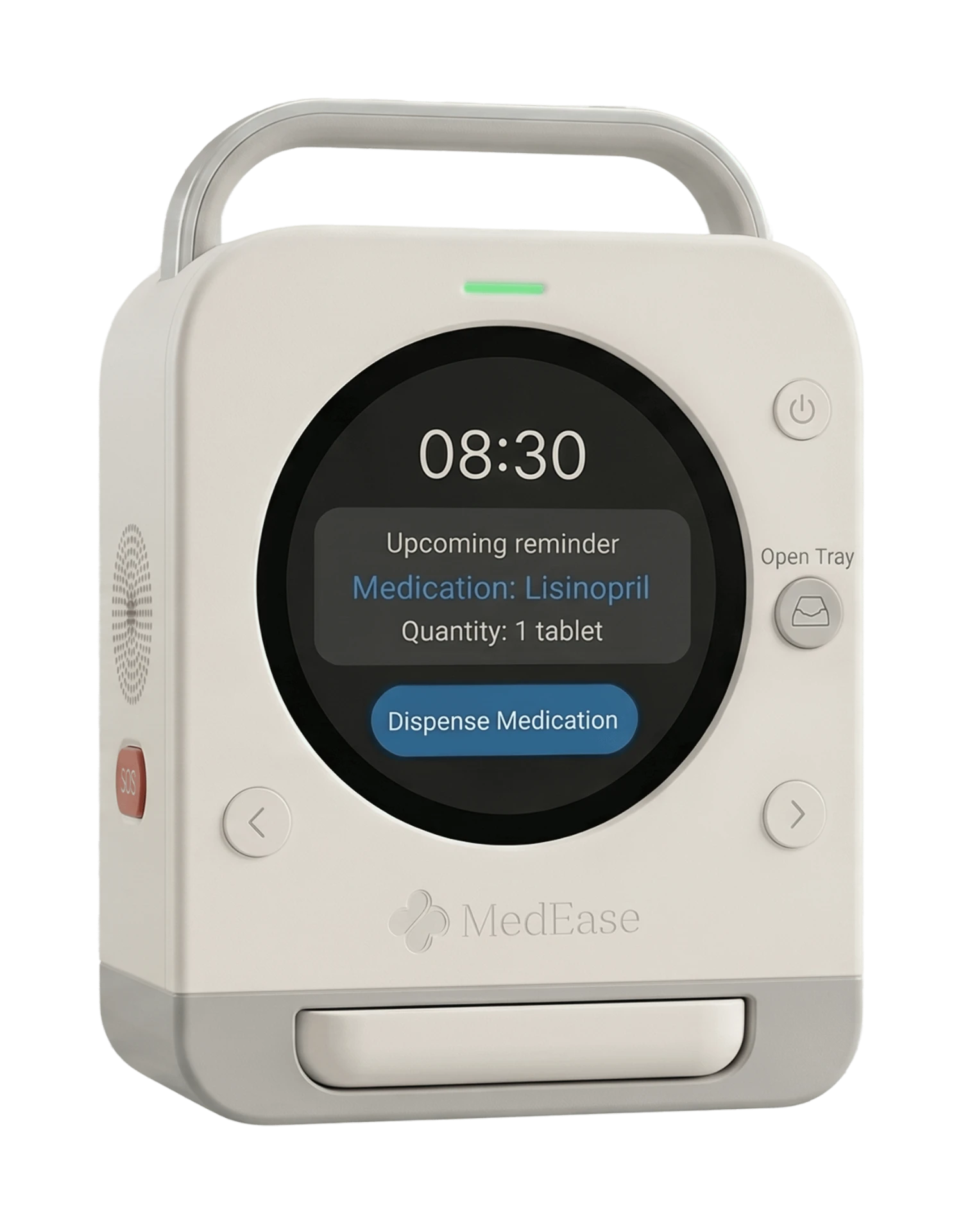
A cartridge-based dispenser, a caregiver app and a quiet feedback loop between them. The story of the product became the story of confidence.

04Design Decisions

Six decisions that shaped the product.

Not every screen. Just the choices a recruiter would ask about.

Decision 01

Caregivers configure medication, not patients

Problem
Elderly users misread dosage, mix strengths, and fear breaking the routine.
Reasoning
Move the cognitive load to the person best positioned to carry it. Setup happens once, in the app, by someone confident with technology.
Outcome
Zero setup friction for the patient. The device arrives already knowing what to dispense and when.

Decision 02

Bluetooth pairing, not Wi-Fi

Problem
Older homes rarely have stable Wi-Fi in the bedroom. Reconnection prompts destroy trust in a health device.
Reasoning
BLE pairs once with the caregiver's phone and syncs opportunistically. The device works even when the network doesn't.
Outcome
No router setup. No 'device offline' anxiety. Reliability the patient never has to think about.

Decision 03

One cartridge per medication

Problem
Weekly pill organisers get refilled wrong. One misplaced tablet becomes a hospital visit.
Reasoning
Physical separation removes an entire category of error. Each cartridge is mapped in the app to a single medication and schedule.
Outcome
Refills become a swap, not a puzzle. Errors drop to near zero at the point of loading.

Decision 04

Multimodal reminders — light, sound, app

Problem
A single channel fails for a single reason: hearing loss, silenced phone, dim room.
Reasoning
Escalate gently across senses before ever escalating to the caregiver. Dignity first, alarm last.
Outcome
Patients respond to the least intrusive cue that works for them, on their terms.

Decision 05

Sensor-confirmed intake

Problem
A dispense event is not a taken event. The gap between the two is where adherence quietly fails.
Reasoning
Weight and IR sensors verify the tray was cleared before marking the dose complete.
Outcome
Caregivers see 'taken', not 'reminded'. The number they trust is finally the number that matters.

Decision 06

Silent confirmation to the caregiver

Problem
Push notifications for every dose train caregivers to ignore them — the opposite of vigilance.
Reasoning
Default to a quiet daily summary. Escalate only on missed doses. Absence of an alert becomes meaningful again.
Outcome
Caregivers stay informed without being interrupted. Trust replaces surveillance.

05Final Experience

One morning, one dose, one quiet handoff.

Instead of a gallery of screens, follow a single moment through the device, the app and the person who cares.

Device, cartridge, caregiver app — one continuous flow rather than three separate products.

  1. 07:58

    A soft glow, not an alarm

    The device warms to life two minutes before the dose. No sound yet. The room simply becomes aware.

  2. 08:00

    Reminder, on their terms

    Ambient light, a gentle chime, and a caregiver-approved message on the display: 'Morning tablets, Amma.'

  3. 08:01

    The tray opens

    The correct cartridge rotates into position. One dose. Never more. The patient never chooses.

  4. 08:01

    Medicine dispensed

    A single tap releases the tablets into a shallow tray at hand height — designed for arthritic fingers, not fine motor skills.

  5. 08:02

    Confirmation, not assumption

    Sensors register the tray being cleared. The dose is marked taken. If it isn't, MedEase waits — quietly — before escalating.

  6. 08:03

    The caregiver exhales

    A silent tick appears in their app. No notification. Just the reassurance that today, like yesterday, is going well.

06Validation

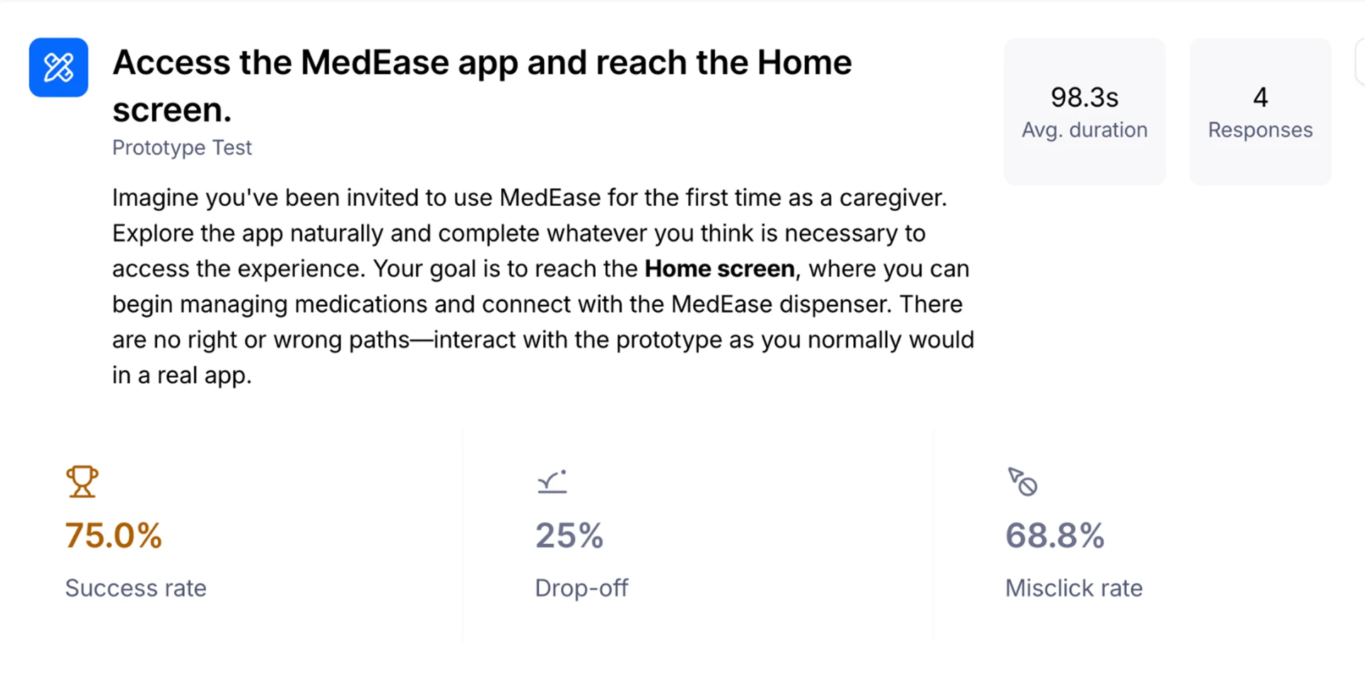
Tested with real caregivers. Iterated until it disappeared.

Two rounds of moderated Maze studies, three rounds of in-home walkthroughs with families.

92%

Task success in moderated tests

4.6/5

Perceived confidence, caregivers

Faster setup after iteration 02

0

Wrong-medication events in testing

Setup

Before

12 steps across two apps and a QR flow.

After

4 steps — cartridge in, pair, name, done.

Reminder tone

Before

Fixed alarm sound that felt clinical.

After

Ambient light first, sound only if ignored.

Caregiver visibility

Before

Push notification for every event.

After

Silent daily summary; alerts only on miss.

07Outcome

Winner. Prototype. And a way of thinking I'll carry forward.

Recognition

Hackathon Winner

60-day multidisciplinary sprint. Working prototype, connected app, tested with caregivers and clinicians.

Team
8 members
Prototype
End-to-end, working

Hardware forces honesty

You can't hide a bad flow behind an animation when someone has to physically hold your product at 8am.

The best notification is silence

Designing for absence — the quiet 'everything's fine' — mattered more than any alert we built.

Confidence is a design material

Every decision, from cartridge shape to summary copy, was really a decision about who feels in control.

Closing

Designing confidence into every dose.

Next project

Museum of Spices

A cultural digital museum reframing how heritage, flavour and story travel across generations. Currently in progress.

In ProgressPreview soon

— Contact

LET'S DESIGN
MEANINGFUL
PRODUCTS
TOGETHER.

— Get in touch

Open to Product Designer roles

Hi, I'm Nitya — a Product Designer focused on Fintech, HealthTech, and Enterprise SaaS. If you're hiring or want to talk about a project, the fastest way is email.

Resume
Usually replies within 24 hoursBengaluru · Remote or onsite
NityaProduct DesignerUX ResearcherDesign ThinkerHuman-CenteredAccessibilityInteraction DesignDesign SystemsResearchNityaProduct DesignerUX ResearcherDesign ThinkerHuman-CenteredAccessibilityInteraction DesignDesign SystemsResearch
© 2026 Nithya ShanmugamDesigned & built with care.